
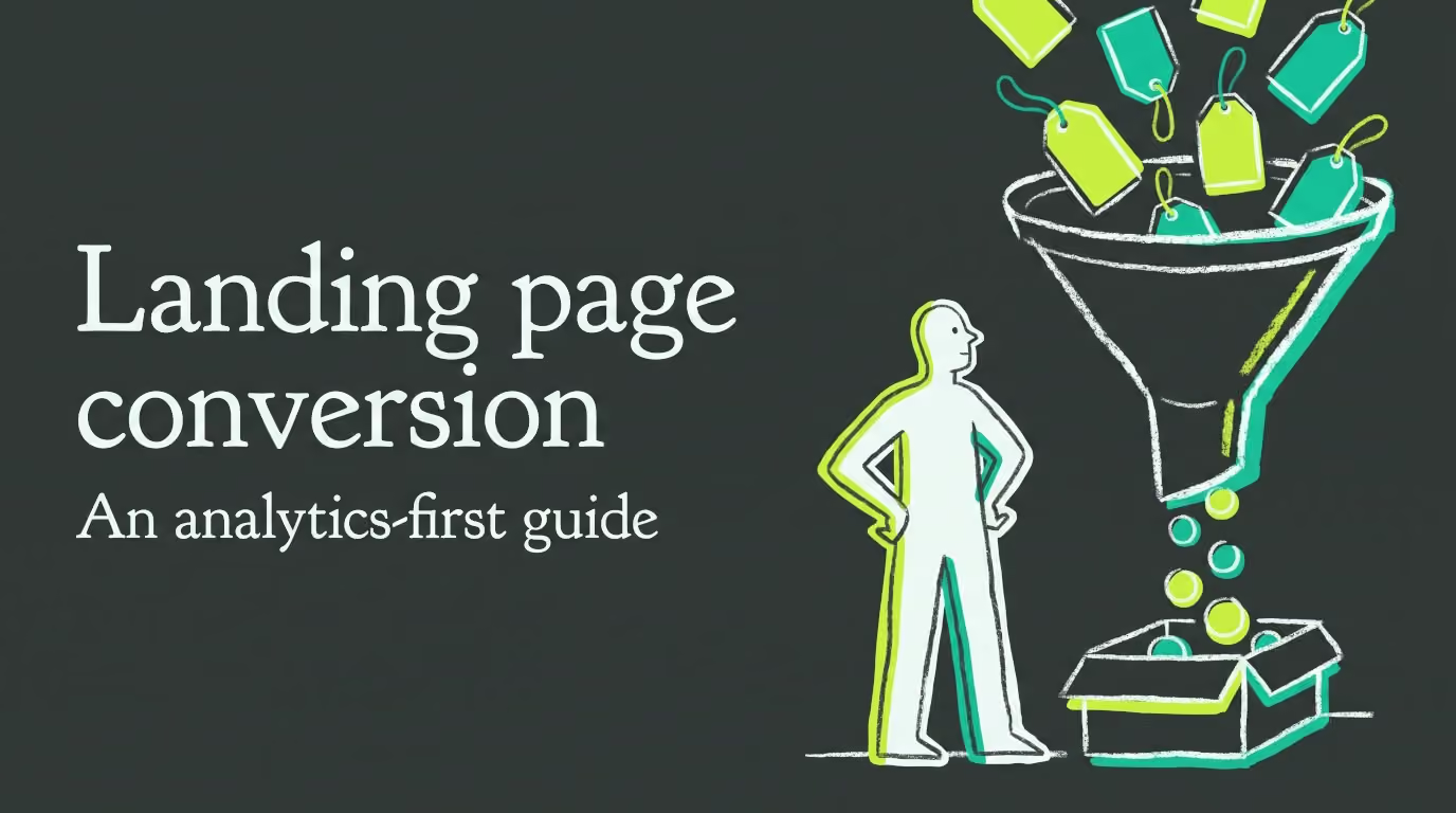

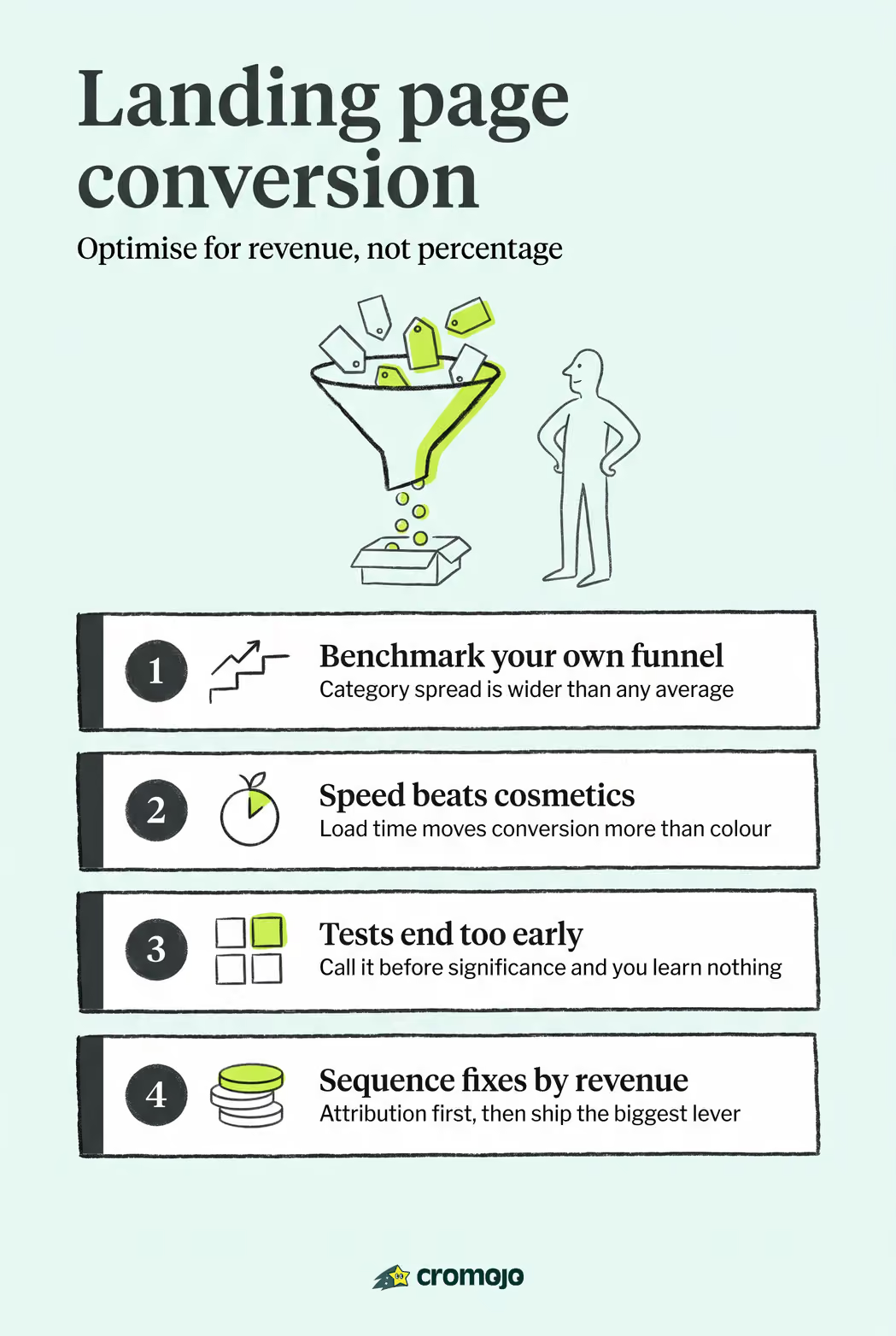
Landing page conversion is the percentage of unique visitors who complete the action you designed the page for, whether that's a purchase, a demo request, or an email signup. You calculate it by dividing conversions by unique visitors over a defined window, and the fastest way to move that number is almost never a redesign. It's speed, message match, and a shorter form.
Those three levers appear again and again in conversion testing at scale, and they share one trait: you can ship all three in a week without touching your brand guidelines or waiting on a designer.
Here's what to run in the next seven days:
- Cut your load time under two seconds. Compress hero images, defer non-critical scripts, and drop any auto-playing video in the header.
- Match your headline to the ad or email that brought the click. If the ad says "50% off running shoes," the headline should not say "Welcome to our store."
- Trim your form to three or four fields. Ask only for what you need to follow up. Everything else can wait until after conversion.
Benchmarks help you set a target, but they're a starting point, not a verdict. A widely cited industry figure puts a "good" landing page conversion rate near 9.7%, while a large-scale test of 2,000 landing pages found medians closer to 4.1% for B2B SaaS, 2.3% for direct-to-consumer ecommerce, and 11.4% for webinar registrations. The right number depends entirely on what you're selling and who's clicking.
Key Takeaways
Landing page conversion improves fastest through page speed, message match, and form simplification, validated by proper A/B testing and measured against revenue, not just clicks.
What Is Landing Page Conversion and How Do You Calculate It?
Landing page conversion measures how efficiently a page turns traffic into action. The formula is simple: conversions divided by unique visitors, expressed as a percentage. Most teams should measure this over a rolling 90-day window, long enough to smooth out weekly traffic swings but short enough to catch a page that's started underperforming.
Not every conversion carries the same weight, and lumping them together produces misleading numbers. Micro conversions are the small commitments along the way: an email signup, a whitepaper download, a "notify me" click. Macro conversions are the outcomes that pay the bills: a completed purchase, a booked demo, a signed contract. A page that's great at collecting emails but terrible at converting them into customers isn't actually a high-converting page. It's a lead magnet with a broken handoff.
Benchmark ranges only make sense when they're tied to a specific funnel type, because the gap between funnel categories is enormous.
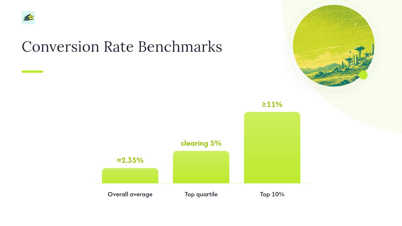
A separate distribution analysis pegs the overall average around 2.35%, with the top quartile clearing 5% and the top 10% of pages hitting 11% or higher. Treat your funnel's median as the floor and the top quartile as your stretch target, not a universal number pulled from a different industry entirely.
One more measurement rule that trips up a lot of teams: never look at a blended conversion rate across all traffic sources. Segment by source before you decide anything is broken.
What Does a High-Converting Landing Page Look Like?
Every element on a high-converting page has a job. If it doesn't earn its place, it's a distraction competing with your call to action for attention.
Above the fold, your headline has one task: confirm the visitor clicked the right link. It should mirror the language of the ad, email, or search result that brought them there. Your subheadline expands that promise into a single, concrete sentence. Your primary CTA should be visible without scrolling, because you don't get a second chance to catch someone who bounces in the first four seconds.
Social proof works when it's specific. A logo wall of vague, unnamed brands does far less for credibility than one named customer with a real result attached. The 2,000-page study found that specific, named social proof consistently outperforms generic trust badges or anonymous testimonial snippets, because specificity is what makes a claim believable in the first place.
Forms deserve their own scrutiny. Ask only for what you genuinely need to follow up, and each extra field can reduce conversions depending on context and funnel value. Shorter forms consistently outperform longer ones, though the calculus shifts for high-ticket B2B offers where a slightly longer form can pre-qualify a lead worth thousands of dollars. Know which situation you're in before you cut a field just because a blog post told you to.
On the technical side, mobile-first design isn't optional anymore. Mobile traffic represents the majority of website visits in most markets, even though desktop sessions often still convert at a higher rate. Your Largest Contentful Paint (LCP) should land under 2.5 seconds, and your total page weight should stay lean enough that a visitor on a spotty connection doesn't give up waiting. Accessibility basics like sufficient color contrast and readable font sizes aren't just compliance checkboxes. They're conversion mechanics for a meaningful slice of your traffic.

Pro Tip: Before adding a video hero, check your load time. The 2,000-page study found that video heroes often reduce conversions because they slow the page down enough to offset whatever engagement the video adds.
Which Landing Page Best Practices Should You Fix First?
Not every fix deserves the same urgency. Rank changes by effort against expected impact, and you'll spend your first sprint on the moves that pay for themselves fastest.
- Fix page speed before anything else. A one-second load time versus a four-second load time can cut conversion by more than half in retail examples. No amount of copywriting fixes a page that hasn't finished loading.
- Match your message to the traffic source. If someone clicked a Google ad for "affordable CRM software," your headline needs the words "affordable" and "CRM" within the first five seconds of scanning.
- Cut form fields to the essentials. Three to four fields is a reasonable default; add a field only if you can name the specific reason it improves lead quality.
- Strengthen social proof with names and numbers. Swap a generic "trusted by thousands" line for one named customer and a specific outcome.
- Add a sticky CTA for long-scrolling pages. Sticky bottom CTAs alone capture nearly all the conversion lift that teams usually chase by stacking multiple CTAs throughout the page.
Removing the top navigation bar is one of the highest-leverage, lowest-effort changes you can make, and it works because it eliminates every exit ramp except the one you want the visitor to take. Expect the lift to vary by traffic quality. A page fed by cold social ads benefits more from a stripped nav than one fed by warm email subscribers who already trust you.
CTA language matters more than most teams assume. "Start Your Free Trial" consistently outperforms "Submit" because it names the benefit instead of the mechanism. Button color matters far less than contrast against the surrounding page. A broad set of tactical checks covers this ground in more depth if you want a reference to work through line by line.
Pro Tip: If your page requires more than one scroll to reach the CTA, repeat the CTA at the bottom instead of relying on visitors to scroll back up. Long pages lose more people to scroll fatigue than to genuine disinterest.
Mobile and accessibility deserve a final pass before you call any of this done. Check that tap targets are large enough for a thumb, that your form doesn't trigger a zoomed-in keyboard that hides the submit button, and that your text remains legible without pinch-zooming.
How Do You Test a Landing Page the Right Way?
A/B testing turns landing page optimization from a debate about taste into an argument settled by data. The setup matters as much as the idea being tested.
A/B split tests compare two full versions of a page against each other and work best when you're testing one clear variable, like headline or hero image. Multivariate tests change several elements simultaneously and reveal interaction effects, but they need dramatically more traffic to reach a reliable result. If your page gets a few hundred visitors a week, skip multivariate testing entirely. You won't hit significance before the test becomes irrelevant.
A useful rule of thumb: aim for at least 1,000 sessions per variant before you draw conclusions, and hold out for 95% statistical significance, the same threshold used across the 2,000-page study referenced earlier. Ending a test early because one variant looks like it's winning is the single most common way teams fool themselves. Random noise in the first few days of a test regularly reverses itself by week two.
Track more than conversion rate alone. Cost per acquisition, revenue per visitor, and lead quality all tell you whether a "winning" variant actually made money or just made cheaper, worse leads. Segment every result by traffic source before declaring victory, because a page redesign that lifts conversion for organic visitors can simultaneously tank it for paid social.
Heatmaps and session recordings won't tell you why a test won or lost, but they'll show you where visitors hesitate, which fields they abandon, and how far they scroll before giving up. Combined with funnel and drop-off analytics, this diagnostic layer is what separates a team guessing at their next test from one running an actual prioritization rubric.

How Should You Prioritize Fixes by Revenue Impact?
Most teams prioritize landing page work by gut feeling or by whoever argued loudest in the last meeting. A better method: rank experiments by expected revenue impact, calculated as Traffic × Change in Conversion Rate × Average Order Value.
A test that lifts conversion by half a percentage point, from 2% to 2.5%, adds 50 orders a month. At $60 average order value, that's $3,000 in monthly revenue from one change. Run the same math on a lead-gen page: 5,000 monthly visitors, a lift from 4% to 5%, and a $2,000 average deal size for the sales team downstream produces 50 additional leads a month, worth far more than the conversion percentage alone suggests.
This is why chasing conversion rate in isolation misleads teams. A test that lifts conversion 20% on your lowest-traffic page will always matter less than a 2% lift on your highest-traffic page, even though the first number looks more impressive in a slide deck.
Getting this math right requires clean attribution, and that's where most teams quietly fall apart:
- Tag every campaign with consistent UTM parameters so traffic source never gets blended into an "unknown" bucket.
- Instrument event tracking on every meaningful action, not just the final conversion, so you can see where the funnel actually leaks.
- Join order data back to the original session using an order key, so a purchase that happens three days after the click still gets credited to the right landing page.
A page can look like a conversion failure when it's actually an attribution failure. If your analytics platform only counts sessions that convert on the same visit, you'll systematically undercount every high-value B2B sale that closes a week after the first landing page click. A revenue-per-visit view split by channel catches this kind of gap before it skews an entire quarter's roadmap.
What Do High-Converting Landing Pages Actually Look Like in Practice?
Abstract principles are easier to apply once you've seen them in specific pages. Here are five patterns worth studying, annotated for what to borrow and what to skip.
A SaaS free-trial page that leads with one number. Instead of a paragraph of feature copy, the headline states a single, specific statistic tied to customer results. Copy the format: one number, one context sentence, one CTA. Skip the temptation to add a second stat right below it, which dilutes the impact of the first.
A webinar registration page with a countdown and a speaker photo. The urgency element works because the webinar has a real date, not a fake scarcity timer. Copy the specificity of the date and time in the visitor's local timezone. Skip vague "limited seats" language unless the seat count is genuinely capped.
A DTC ecommerce page with a three-field checkout form. Email, shipping address, payment. Nothing else on the first screen. Copy the discipline of deferring every optional field (birthday, marketing preferences) to a post-purchase screen. Skip adding a newsletter opt-in checkbox above the "buy" button. It's a distraction at the exact moment you want zero friction.
A B2B lead-gen page that replaced its stock-image hero with a value-props grid. Instead of a photo of people smiling at laptops, the top of the page shows three concrete benefits with icons. This kind of change can accelerate qualification for a technical buyer who's scanning for relevance, not inspiration. Copy the directness. Skip generic imagery that says nothing about the product.
An agency services page with a single named client story instead of a logo wall. One paragraph, one name, one measurable result. Copy the specificity. Skip the instinct to add five more logos around it; the named story does more work alone.
A page usually fails for one of three reasons: the headline doesn't match what the visitor expected to find, the page takes too long to load, or the navigation gives people an easy way to leave before they've seen the offer.
Every one of these examples shares a trait worth naming directly: they earn trust through specificity, not decoration. A generic template with stock photography and vague claims erodes trust faster than almost anything else on a page, no matter how polished the design looks.
What Should Your First 90 Days of Landing Page Work Look Like?
Spreading optimization work across three deliberate sprints keeps a team from trying to fix everything at once and measuring nothing well.
- Days 1 to 30: fix the fundamentals. Get load time under two seconds, align every headline with its traffic source, remove the top navigation from your primary conversion pages, and cut form fields to the essentials. These changes require no new experiments to justify. The data already supports them.
- Days 31 to 60: design your first real experiments. Rebuild social proof around named customers with specific results, add a sticky CTA, and run a proper A/B test on your headline or hero section. This is also the point to give mobile layouts a dedicated polish pass, since most of your traffic is arriving on a phone.
- Days 61 to 90: scale what worked and validate the numbers. Roll winning variants out to adjacent pages, start a personalization experiment for returning visitors or a specific traffic source, and audit your revenue attribution to confirm the lifts you measured actually show up in Stripe or Shopify data, not just in your analytics dashboard.
The sequencing matters. Testing a headline before your page loads in under two seconds means you're testing on top of a broken foundation, and any lift you measure will be smaller than what you'd see once speed stops being a bottleneck.
What Do Teams Consistently Get Wrong About Optimization?
The biggest waste of time in landing page work isn't a bad idea. It's a good idea tested badly.
Teams routinely burn weeks arguing over button color or whether the headline font should be 32px or 36px, debates that produce almost no measurable conversion difference. Meanwhile, the page loads in four seconds and nobody's tested that at all. The instinct to fight over visual details comes from a reasonable place: design choices are easy to have an opinion about, and speed or form-length fixes feel less creative. But conversion rate doesn't reward creativity. It rewards removing friction.
A second recurring mistake is testing too many variables in one experiment. A team changes the headline, the hero image, and the CTA button simultaneously, then declares the new version a "winner" without knowing which change actually drove the lift. When they try to replicate that win on a different page by copying just the headline, it does nothing, because the headline was never the variable that mattered.
Here's a version of a mistake that shows up often enough to be worth naming directly. A team hypothesizes that a long-form sales page with extensive social proof will outperform a short, direct page for a mid-priced B2B tool. They build both, run the test, and the short page wins by a wide margin, not because long-form copy is bad, but because their buyer was a technical evaluator who wanted three specific facts, not a persuasion essay. The fix wasn't a better long-form page. It was recognizing that the audience determines the format, and no amount of copywriting skill overrides a mismatched hypothesis.
The remedy for all three problems is the same: test one variable at a time, prioritize by expected revenue impact rather than internal enthusiasm, and always split results by traffic source before deciding what "winning" means. Ignoring channel splits is how a team convinces itself a redesign worked when it actually just shifted which segment of traffic got credit for conversions that were happening anyway.
How Cromojo Ties Landing Page Changes to Real Revenue
Testing a headline or trimming a form is only half the job. The other half is proving the change actually made money, and that's where most teams' analytics setups fall short. Cromojo is built for exactly that gap: it attributes real-time revenue to the specific pages, keywords, and channels that produced it, using direct integrations with Stripe and Shopify instead of estimated conversion math.
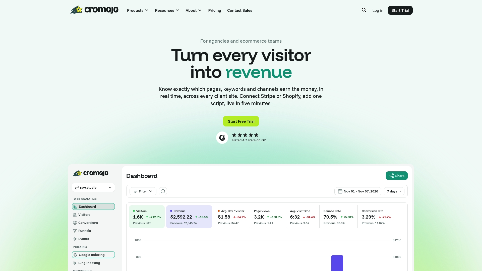
For an ecommerce team, that means seeing revenue per visit broken out by landing page variant, not just a conversion rate that hides whether the winning version actually attracted higher-value orders. For an agency managing several client sites, it means proving to a client that a redesign lifted revenue, not just clicks, with a report that doesn't require a data analyst to interpret. Cromojo's cookieless tracking also means this level of attribution doesn't depend on a consent banner working correctly on every device.
If you're running landing page experiments right now and can't say with confidence which page made money last month, start with Cromojo's revenue attribution reporting and connect your Stripe or Shopify account to see it firsthand.
Where to Learn More About Landing Page Optimization
A few resources are worth bookmarking if you want to go deeper on testing methodology and benchmarks beyond what's covered here.
The 2,000-page conversion study is the most current large-scale dataset available, with funnel-specific medians and controlled tests on hero types, CTA placement, and social proof formats. Mailchimp's high-converting landing page guide offers a solid benchmark reference alongside practical design guidance for smaller teams. Leadpages' analysis of speed and conversion makes the mathematical case for prioritizing page speed over cosmetic changes, with real load-time comparisons. The data-driven optimization framework from Discovered Labs digs into form-field research in more detail than most guides bother with. Unbounce's 101 optimization tips remains a useful tactical checklist to sweep a page against before launch. For an agency-specific take on value proposition and CTA structure, Fylde Digital's guide covers the fundamentals clearly, and Canty Digital's 2026 design guidance is a solid reference for mobile-first layout decisions. Neil Patel's guide to high-converting pages rounds things out with a broader testing-process framework.
Sources
- Landing Page Conversion: 2,000 Pages Tested in 2026
- How to Create a High Converting Landing Page - Mailchimp
- Landing Page Optimization: A Data-Driven Framework for Higher Conversion Rates
- Statista — global mobile phone website traffic share