



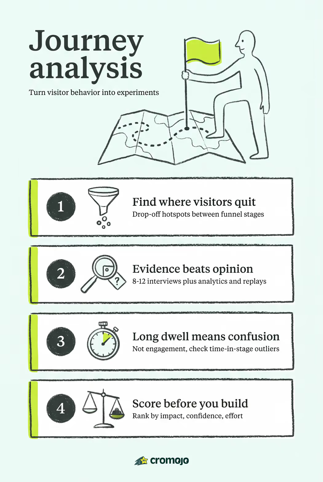
Visitor journey analysis is the process of mapping observed visitor behavior across every touchpoint, then turning those observations into a prioritized, testable list of changes that reduce friction and lift conversion. Before you read any further, run these three checks right now:
- Drop-off hotspots: Where does your funnel lose the most visitors between stages? Pull your analytics and sort by exit rate per step.
- Time-in-stage outliers: Which stages take far longer than expected? Unusually long dwell times often signal confusion, not engagement.
- Channel-transition failures: Where do visitors switch from one channel or device to another and then disappear? These handoff points are where journeys break most quietly.
Your best starting evidence: web analytics, session replay recordings, support ticket themes, and at least a handful of user interviews. Each source answers a different question, and you need all four to build a map worth acting on.
Key Takeaways
Visitor journey analysis turns observed visitor behavior into a prioritized, evidence-backed list of experiments that reduce friction and increase conversion at every stage of the customer journey.
What is visitor journey analysis and why does it matter?
Customer journey analytics is a structured method for understanding the full experience a visitor has with your product or brand, from first awareness through purchase, activation, and beyond. It differs from a user flow (which traces clicks through a UI) and from a feature list (which catalogs capabilities). A journey map is a human-centric narrative: it captures what visitors do, what they think, and how they feel at each stage.
The critical distinction is what journey analysis adds on top of your analytics dashboard. Analytics tells you what happened; a journey map explains why it happened and how visitors felt during it. A significant drop-off on your pricing page is a data point. A journey map tells you that visitors at that stage are comparing you to alternatives, feel uncertain about contract terms, and have already emailed support twice. That context is what turns a dashboard observation into a product decision.
The business case is concrete. Industry findings cited by journey mapping guides suggest that companies with a formal customer journey management program report substantially better year-over-year marketing ROI and referral revenue compared to those without one. The mechanism is straightforward: when your team agrees on where the friction is and why it exists, you stop debating opinions and start running experiments.
Four benefits stand out for most teams:
- Cross-functional alignment: Product, marketing, and support stop arguing about priorities because they share the same evidence base.
- Fewer wrong bets: You invest in fixes that address real friction, not hypothetical ones.
- Better activation and retention: Identifying where new users stall lets you intervene before they churn.
- Cleaner attribution: Linking journey stages to revenue metrics shows which fixes actually moved the number.
Core components every useful journey map must include
A map without the right components becomes a slide-deck decoration. According to UX Blueprints' journey mapping guide, the artifact should be a living document that links back to raw evidence so decisions can be traced during reviews. These are the components that make that possible:
- Persona: A research-backed profile of the visitor segment the map covers. One map per primary persona keeps the analysis focused.
- Scenario: The specific goal the persona is trying to accomplish (e.g., "evaluate and purchase a subscription plan").
- Stages (4-7): The major phases of the journey. Fewer than four collapses important distinctions; more than seven makes the map unreadable and hard to prioritize.
- Actions: What the visitor does at each stage, described in behavioral terms, not UI clicks.
- Touchpoints and channels: Where the interaction happens (organic search, email, in-app, support chat, mobile vs. desktop).
- Emotions and thoughts: How the visitor feels and what questions they have. This is the layer analytics cannot supply on its own.
- Pain points and opportunities: Specific friction signals and the improvement hypothesis each one suggests.
- KPIs and time-in-stage: The measurable signal that tells you whether a stage is healthy. Time-in-stage and conversion rate by stage are the two most useful defaults.
- Owner: The team or individual responsible for acting on each stage's findings. A map with no owners produces no experiments.
Here is a compact example row to anchor the concept:
Which type of journey map should you build?
Choosing the wrong map type wastes weeks. UX Blueprints recommends selecting by the question you need to answer, not by what looks most impressive in a presentation. Here are the five types and when each earns its place:
For most product and marketing teams, the current-state map is the right starting point. Build the future-state map only after you have a clear picture of what is broken today.
Which data sources give you the most reliable evidence?
A journey map built on assumptions is an opinion document. NN/G's practitioner survey of 343 respondents found that interviews are the most-used research method for journey mapping projects, with roughly 86% of respondents using them for external research. That prevalence reflects a real truth: interviews surface the motivations and emotions that no analytics tool can capture.
Here is how to think about each source:
Web analytics reveal volume and sequence. They tell you where visitors go, how long they stay, and where they leave. The bias: they show behavior but not intent. Prioritize these first to identify where to look.
Session replay shows the micro-behavior within a stage: rage clicks, scroll depth, form abandonment. The bias: you see what visitors do, not why. Use it to validate hypotheses from analytics before investing in qualitative research.
Support tickets and chat logs are an underrated signal. Recurring themes in support data indicate friction that visitors cannot resolve on their own. High ticket volume on a specific topic is a strong confidence signal.
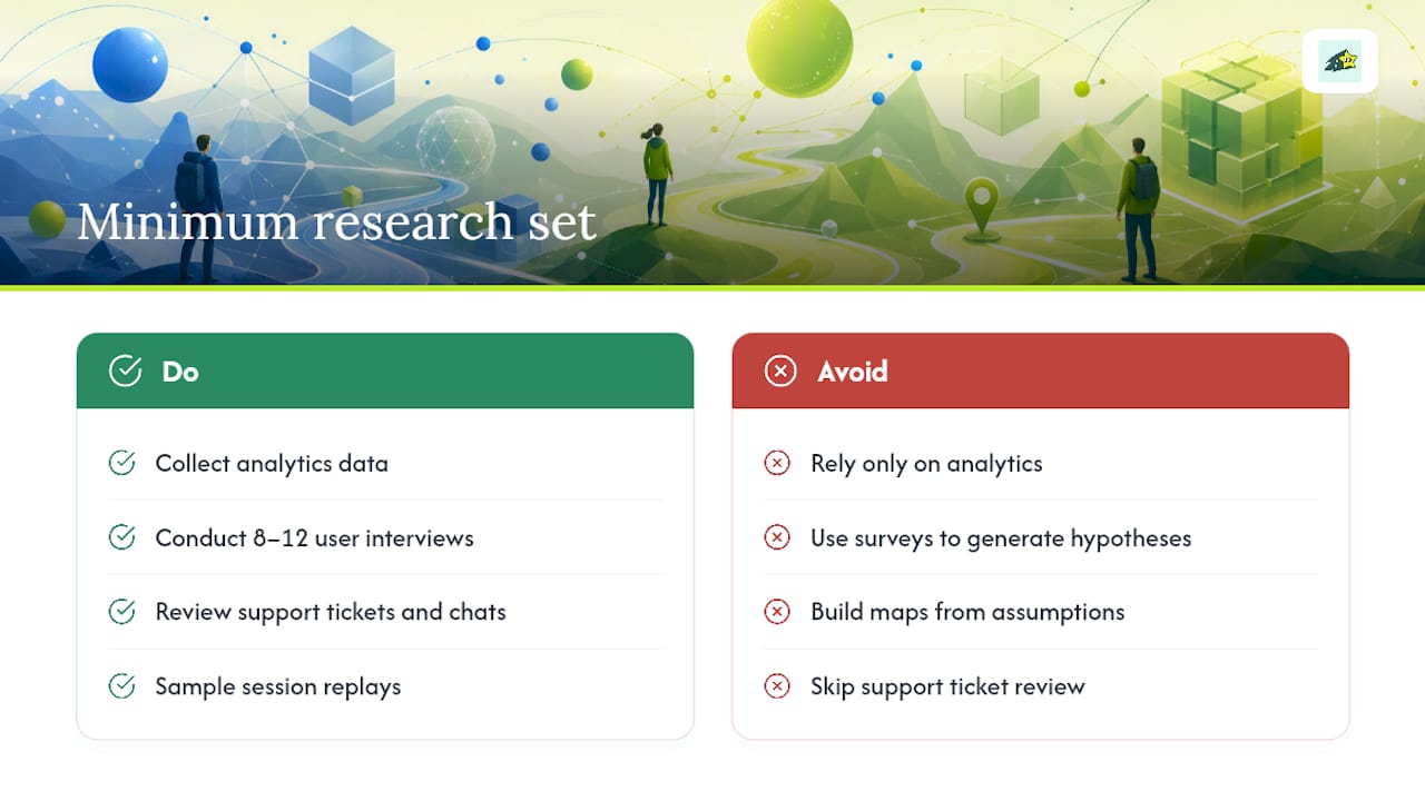
User interviews (8-12 for a current-state map) provide the motivational layer. They explain the emotions and thoughts your map needs. The bias: self-report is imperfect; what people say they do often differs from what they actually do.
Surveys give you scale on specific questions. Use them to quantify a hypothesis you formed from interviews, not to generate hypotheses from scratch.
Diary studies are underused but valuable for long or complex journeys. Pairing short diary entries with follow-up interviews captures temporal context that a one-off session misses, particularly for journeys that span days or weeks.
For a valid current-state map, the minimum research set is: analytics data + 8-12 interviews + support ticket review + session replay samples. That combination gives you behavioral volume, qualitative motivation, and recurring friction in one evidence base. Linking your map to raw evidence sources means every decision during a review can be traced back to data rather than memory.
Confidence scoring rubric: Rate each insight on a 1-3 scale across three dimensions: session volume (how many visitors exhibit this behavior), qualitative frequency (how many interviewees mentioned it), and support signal (how often it appears in tickets). Sum the scores. Insights scoring 7-9 are high-confidence and should be prioritized for experiments. Scores of 4-6 warrant one more round of validation. Scores below 4 are hypotheses, not findings.
How to analyze a journey map step by step
NN/G identifies seven practical indicators for analyzing a journey map: unmet expectations, unnecessary touchpoints, friction points, channel transitions, time spent, moments of truth, and high points. Here is how to work through them systematically:
Prepare your hypothesis. Before reviewing data, write down what you expect to find at each stage. This prevents confirmation bias and gives you a baseline to measure against.
Gather cross-source evidence. Pull analytics by stage, collect session replay clips for the top three drop-off points, and export the last 90 days of support tickets tagged by journey stage.
Apply the seven analysis lenses. For each stage, ask:
- Unmet expectations: What did visitors expect to find that wasn't there?
- Unnecessary touchpoints: Which steps add no value and could be removed?
- Friction points: Where do visitors slow down, abandon, or ask for help?
- Channel transitions: Where do visitors switch device or channel and fail to continue?
- Time spent: Which stages take longer than they should, signaling confusion?
- Moments of truth: Which single interaction most strongly determines whether the visitor continues?
- High points: What is working well that you should protect or amplify?
Map each signal to a measurable metric. Friction at checkout maps to cart abandonment rate. A channel-transition failure maps to cross-device conversion rate. Naming the metric forces specificity and makes the experiment design obvious.
Estimate impact and confidence. Use the confidence rubric from the previous section. For impact, look at historical conversion deltas by stage when available. A stage with a 30% drop-off and high qualitative support signal is a higher-priority fix than a stage with a 5% drop-off and a single interview mention.
Score with a simple formula. Rank each opportunity using: Impact × Confidence ÷ Effort. Score each dimension 1-5. A fix that scores 4 on impact, 3 on confidence, and 2 on effort produces a priority score of 6. Sort your list by this score and work from the top.
Design the experiment. Write a hypothesis ("If we add a comparison table to the pricing page, we expect pricing-page exit rate to drop by 10-15% for visitors in the evaluation stage"), define success metrics, estimate sample size, and assign an owner.
Pro Tip:Keep stage labels behavioral ("comparing options") rather than product-centric ("visits pricing page"). Behavioral labels stay accurate even when the UI changes, which means your map stays useful longer.
How to run a 90-minute journey-mapping workshop
A well-run workshop produces 2-3 testable hypotheses in a single session. NN/G's practitioner research confirms that teams create maps collaboratively, drawing on product, marketing, and support together. Here is a timed agenda that works:
Roles to assemble: Facilitator, note-taker, analytics owner (brings data printouts or a live dashboard), product owner (brings backlog context), and a support representative (brings ticket themes).
Agenda:
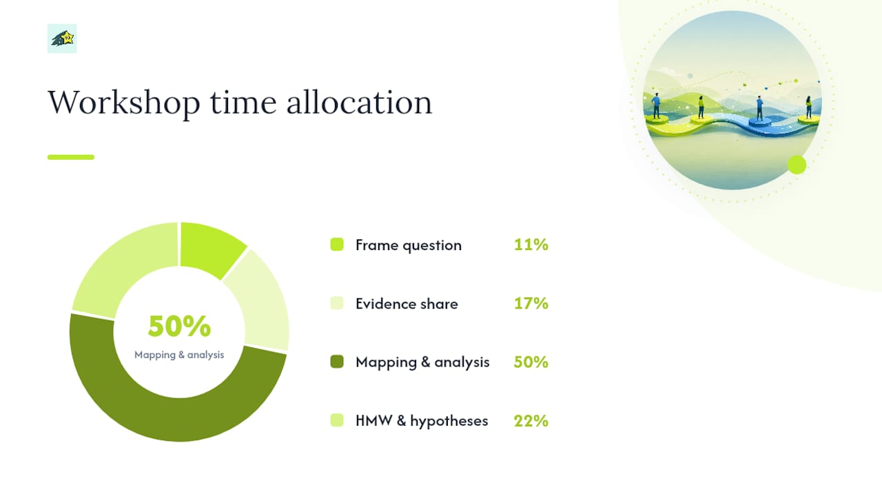
- 0-10 min: Frame the question. The facilitator states the persona, scenario, and the specific question the workshop must answer (e.g., "Why do evaluation-stage visitors not convert to trial?").
- 10-25 min: Evidence share. Each role presents their top three signals in two minutes. Analytics owner shows drop-off data. Support rep shares top ticket themes. Product owner flags known backlog items.
- 25-50 min: Map the current state. The group builds or reviews the current-state map stage by stage on a shared Miro or Figma board, adding emotions and pain points as sticky notes.
- 50-70 min: Apply the seven lenses. The facilitator walks through NN/G's seven analysis points. The group votes on the top three friction signals using dot voting.
- 70-85 min: Generate "How Might We" questions. For each top signal, the group writes one or two "How Might We" (HMW) statements. Example: "How might we help evaluation-stage visitors understand pricing without leaving the page?"
- 85-90 min: Convert to hypotheses. Each HMW becomes a testable hypothesis with a named owner and a proposed success metric.
Output: A prioritized list of 2-3 hypotheses, each with an owner, a success metric, and a proposed experiment type (A/B test, content change, onboarding flow update).
Pro Tip: Send participants a one-page pre-read 24 hours before the workshop: the persona profile, the current funnel data, and the top five support ticket themes.
Turning map findings into experiments and measurable KPIs
Analysis without follow-through is the most common failure mode in journey mapping. NN/G is direct on this point: a beautiful diagram with no follow-through produces no cross-functional alignment and no product decisions. The fix is a structured handoff from map to experiment.
Here is a sample prioritization table format for your team:
For each experiment, document: the hypothesis, the primary success metric, the secondary guardrail metric (what you will not let get worse), the minimum sample size needed for statistical confidence, the rollout plan (percentage of traffic, duration), and the named owner.
KPIs to track journey fix impact:
- Conversion rate by stage (the primary signal for most fixes)
- Time-in-stage (a proxy for confusion or friction)
- NPS or CSAT change at the affected touchpoint
- Revenue per visitor for the affected segment
- Support ticket volume for the friction theme you addressed
Set target deltas before you run the experiment. If you cannot name a target delta, the hypothesis is not specific enough to test.
Teams that link map opportunities directly to revenue or conversion metrics secure roadmap slots faster and prove impact more clearly than teams that report only qualitative findings. Connecting UX improvements to SEO and acquisition outcomes extends that revenue case further up the funnel.
Which tools should you use for mapping and acting on insights?
The right tool depends on the job. UX Blueprints recommends treating the artifact as both a living document and a shareable visual, which usually means two tools working together rather than one.
Miro is the best choice for collaborative workshops. Its infinite canvas, sticky notes, and voting features make it the natural home for a live mapping session. The built-in journey map templates get a team to a working draft in under 20 minutes.
UXPressia is purpose-built for journey mapping. It handles multi-persona maps, impact maps, and persona profiles in one place, and exports polished artifacts for stakeholder presentations. Use it when you need a shareable, professional-grade deliverable.
Figma works well for teams that already live in it for design. Journey maps in Figma stay close to the product design work, which makes it easier to connect a friction finding directly to a design solution in the same tool.
Notion is the right home for the living document version of your map. Link Notion pages back to your analytics segments, session recordings, and support ticket exports so every decision during a quarterly review can be traced to its evidence source.
Google Sheets or Excel remain the most practical option for the prioritization scorecard and the KPI tracking plan. A simple spreadsheet with the impact × confidence ÷ effort formula is faster to maintain than any dedicated tool.
For measuring the revenue impact of journey fixes, you need an analytics layer that connects visitor behavior to actual transactions. Cromojo's revenue attribution features let you track which pages, stages, and channels generate real sales, so when you run an experiment on your pricing page, you can see whether it moved revenue, not just clicks. Its conversion funnels and segmentation features map directly onto the stage-by-stage analysis this guide describes, and its real user monitoring capabilities surface performance friction that journey maps often miss.
Common mistakes that make journey maps useless
Most journey maps fail not because the research was bad but because the process broke down after the workshop. Here are the six pitfalls that kill maps most often, and how to avoid each one.
- Treating the map as a static deliverable. A map that reflects last quarter's product is wrong by definition. Schedule a review every quarter or after any significant product change.
- Too many stages. More than seven stages makes the map unreadable and impossible to prioritize. Collapse adjacent steps until you have 4-7 meaningful phases.
- Opinion-heavy maps. If your map was built in a workshop with no analytics or interview data, it reflects team assumptions, not visitor reality. Validate every pain point with at least one external evidence source before acting on it.
- Ignoring channel transitions. Visitors who switch from mobile to desktop, or from organic search to direct, are at high risk of dropping off. These transitions are rarely visible in standard funnel reports but show up clearly in cross-device analytics and session data.
- No named owners per stage. A map with collective ownership has no ownership. Assign one team or individual to each stage and make them responsible for the KPI that stage tracks.
- No follow-through to experiments. A map that produces a presentation but no backlog items or A/B tests has delivered zero value. The workshop output must include at least one experiment with a named owner and a launch date.
Maintenance cadence: Review the map quarterly as a default.
Governance checklist:
- One named owner per stage
- Quarterly review date on the calendar
- Decision criteria for roadmap inclusion (minimum confidence score, minimum expected uplift)
- Living map stored in Notion or a linked doc platform with references to raw evidence
- Experiment log tracking hypothesis, result, and revenue impact for every completed test
What practitioners actually learn from doing this
The teams that get the most from visitor journey mapping share a few consistent habits. Here is what the evidence and practitioner experience point to.
Cross-functional workshops produce better maps than solo analyst work. When a support representative sits next to a product manager during a mapping session, the support rep's ticket themes immediately challenge assumptions the product team has held for months. That collision of perspectives is where the most valuable friction signals surface.
Small experiments beat big redesigns. A team that identified a channel-transition failure between email campaigns and their mobile checkout ran a single experiment: adding a persistent cart-recovery banner for visitors arriving from email on mobile. The fix took two days to build. Time-in-stage for that segment dropped noticeably, and checkout completion for email-sourced mobile visitors improved within the first two weeks of the test.
Linking fixes to revenue changes the conversation. When a journey team can show that reducing friction at the evaluation stage moved revenue per visitor for that segment, the map stops being a UX artifact and becomes a business case. That shift in framing is what gets journey analysis a permanent seat in sprint planning rather than a one-time research project.
The micro-lesson worth copying: after every experiment, add one row to your experiment log with the hypothesis, the result, and the revenue delta. After three or four cycles, you will have a track record that makes the next roadmap conversation much shorter.
Cromojo connects your journey fixes to real revenue
When your journey map points to a friction fix, the next question is always: did it work? Cromojo gives you a direct answer.
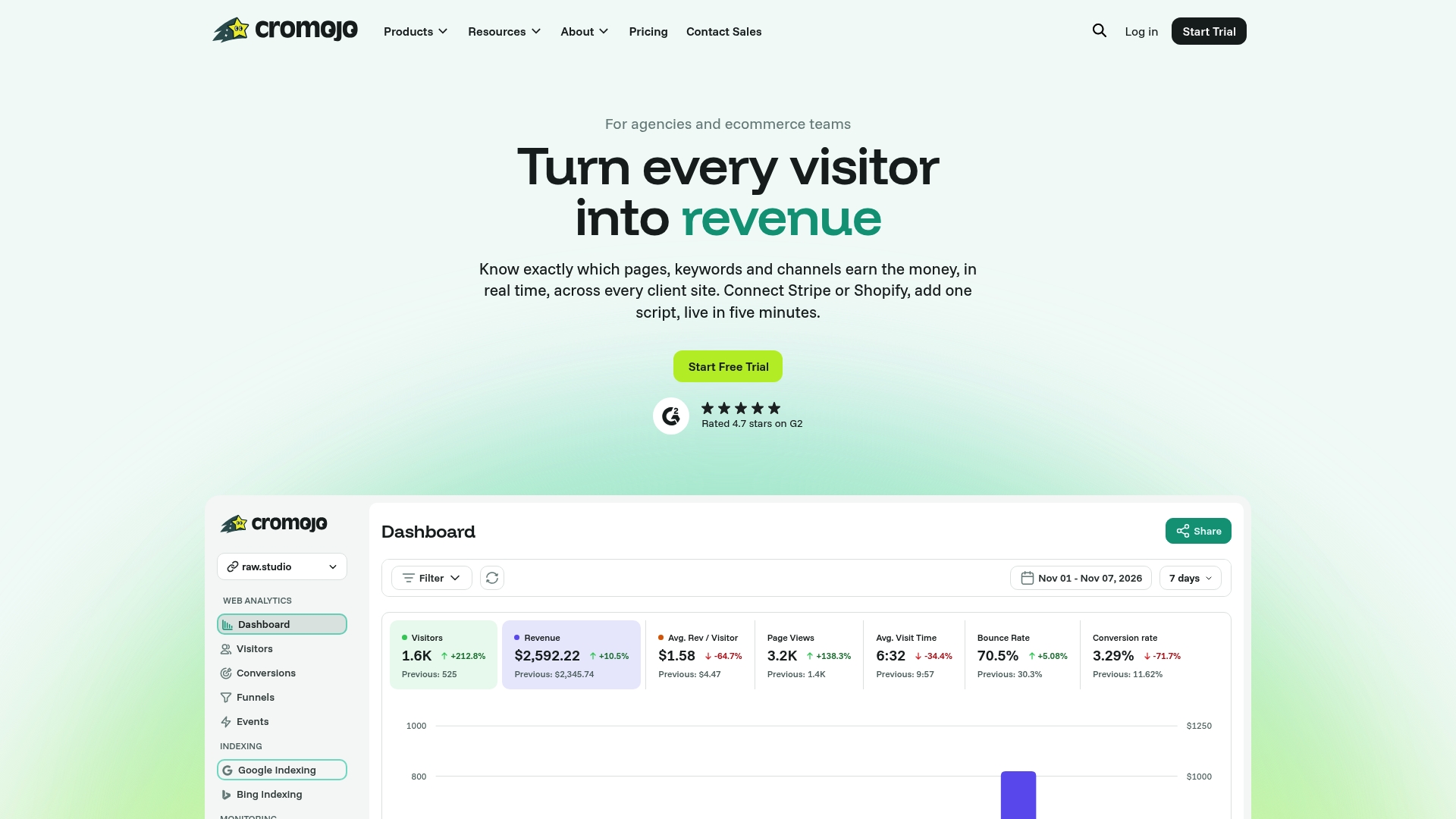
Cromojo's revenue attribution platform tracks which pages, keywords, and channels generate actual sales, so you can measure the revenue impact of every experiment you run from your journey map. Its conversion funnels mirror your journey stages exactly, and its advanced segmentation lets you isolate the visitor cohort your fix targeted. Setup takes minutes: one lightweight script, no cookies, no compliance headaches. Cromojo integrates with Stripe and Shopify, so revenue data flows in automatically. If you want to know whether your pricing-page experiment moved the number that matters, start a free trial and connect your first funnel today.