
.avif)

AI has made digital execution dramatically easier.
A founder can generate a landing page in an afternoon. A marketer can produce dozens of headline variations before lunch. A small team can create illustrations, write product descriptions, analyse customer feedback, and prototype entire websites using tools that were inaccessible only a few years ago.

This shift is remarkable, but it also creates a new problem. When everyone has access to similar AI tools, producing something competent is no longer enough to stand out.
The same models can suggest similar conversion patterns. The same website builders can generate familiar layouts. The same prompts can produce comparable headlines, feature sections, comparison tables, and calls to action.
Execution becomes faster, but sameness becomes easier.
That is why emotional design is becoming a competitive advantage in the AI era. As the technical baseline rises, the brands that win will increasingly be those that make people feel something specific, whether that is confidence, desire, curiosity, belonging, excitement, relief, or trust.
In this article, we will explore why AI is standardising digital execution, why users form opinions about websites so quickly, and how storytelling, typography, photography, and layout hierarchy can influence trust and action. We will also examine where AI-generated experiences often fall short and how website monitoring can help teams connect design quality with measurable engagement, performance, and conversion outcomes.
AI Has Standardised Execution
Not long ago, creating a polished digital experience required access to a specialised team. You needed designers, copywriters, developers, analysts, photographers, and marketers. Even producing a credible landing page could take weeks.
Today, the barriers are much lower.
AI can generate a first draft of the copy, suggest a page structure, write calls to action, create imagery, summarise research, produce code, and propose experiments. This gives smaller teams access to capabilities that once required substantial budgets and specialist resources.
That democratisation is good for business. It allows founders and marketing teams to move faster and compete with larger organisations.
However, it also changes where differentiation comes from.
When every company can ask an AI system to create a high-converting SaaS landing page, the output naturally begins to converge around familiar patterns. You get the bold headline, the short supporting paragraph, the primary call to action, the row of customer logos, the feature cards, the testimonial section, and the pricing block.
None of these elements are inherently wrong. In many cases, they exist because they work.
The problem is that functional correctness is not the same as memorability.
A website can follow every accepted UX principle and still feel completely interchangeable with ten competitors. AI is raising the floor of digital execution, but emotional design raises the ceiling.
When Everyone Has the Same Tools, Design Becomes the Difference
Brands increasingly have access to the same tools.
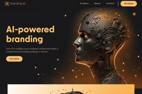
Anyone can create a landing page. Anyone can ask AI to improve a headline. Anyone can generate a polished section explaining features and benefits.
The question is no longer simply whether you can produce a website.
The real question is whether the experience feels unmistakably like your brand.
This is where design and brand strategy become more important.
A strong brand creates recognition before a visitor has consciously processed every word. It communicates personality through choices that cannot be reduced to a generic conversion template.
Photography can make a brand feel adventurous rather than cautious. Typography can communicate authority rather than friendliness. Spacing can make a premium product feel calm and considered. Art direction can make a technical product feel energetic, human, or rebellious.
These decisions influence interpretation before the visitor consciously analyses the page.
AI can accelerate the work, but the business still needs to decide what emotional territory it wants to own.
Users Decide Faster Than Most Websites Communicate
The AI era is also changing how people arrive on websites.
Historically, a customer might discover a company through search, visit the homepage, browse several pages, read about the business, compare options, and gradually develop confidence.
Increasingly, much of that research can happen before the website visit.
A customer may ask an AI assistant to compare products, summarise reviews, explain pricing differences, or recommend providers for a specific problem. By the time that person reaches your website, they may already understand what you sell.
They are not necessarily arriving to begin their research.
They may be arriving to verify a decision.
This distinction matters.
The website increasingly becomes a human moment at the end of an information-rich journey. The visitor arrives with expectations already formed. Your job is not always to educate them from zero. Often, it is to avoid breaking the confidence that brought them there.
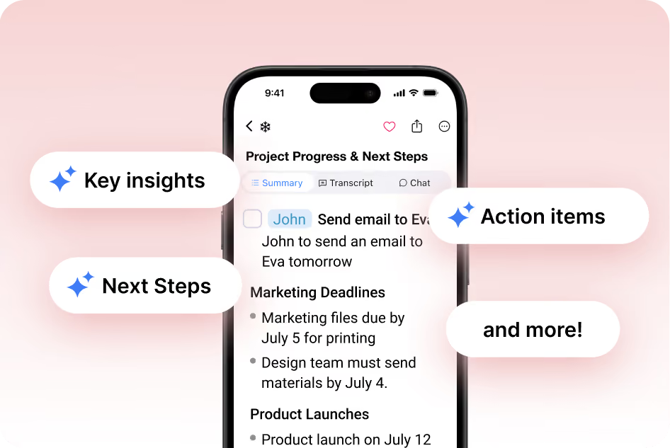
If an AI summary suggested a sophisticated premium service but the website looks amateur, confidence drops. If the visitor expects transparent pricing but encounters confusing packages, friction appears. If the brand promises innovation but the experience feels generic, the story becomes inconsistent.
A customer can leave before your carefully written argument has a chance to work.
Visual Trust Happens Before Rational Analysis
Human beings do not encounter a website as a spreadsheet of facts.
We see it, feel it, and interpret it.
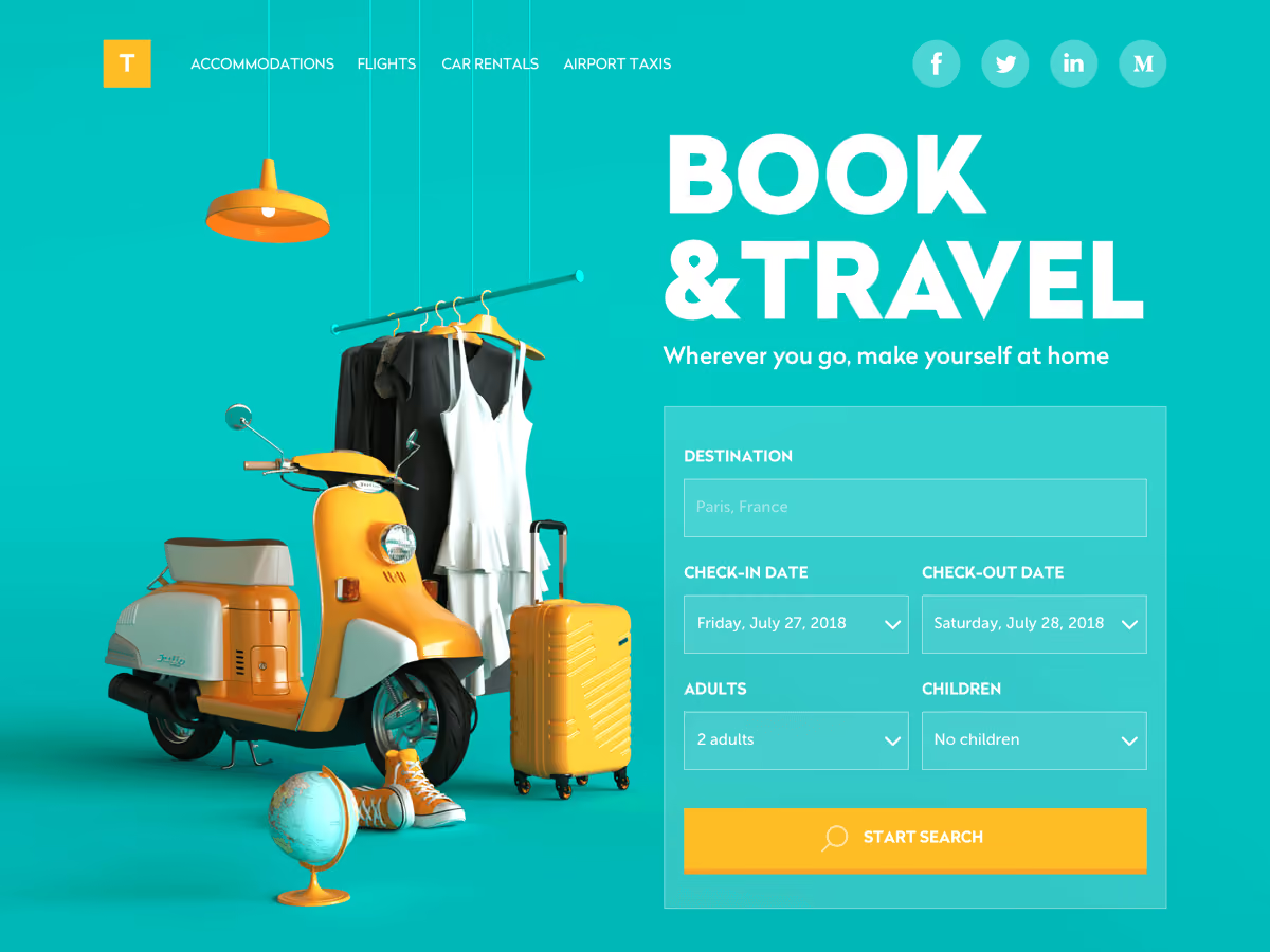
Colour, scale, imagery, spacing, movement, and composition all shape our first impression before we consciously evaluate every claim.
Think about walking past two physical stores.
One has thoughtful lighting, a coherent visual identity, carefully displayed products, and a sense that every detail belongs together. The other looks improvised and inconsistent.
You have not inspected the supply chain. You have not interviewed the staff. You have not evaluated the financial stability of either company.
Yet you already feel differently about them.
Websites work in a similar way.
Visual design creates expectations. A polished interface can suggest care. Consistency can suggest competence. High-quality photography can make a product feel tangible and desirable. Clear hierarchy can make a complicated offer feel easier to understand.
This does not mean attractive design can compensate for a bad product.
It means design influences whether people feel comfortable enough to investigate the product further.
That distinction is crucial for conversion.
Cromojo's guide to conversion rate optimization makes a related point: attracting more traffic is not enough when the experience fails to turn existing visitors into customers.
The real opportunity is not simply generating attention. It is making the moment after attention count.
Designing for the Human Moment

There are four questions that shape buying behaviour. Together, they form a practical framework for evaluating whether a digital experience supports conversion.
Does the visitor understand the offer?
Do they believe it?
Do they feel safe moving forward?
Does the next step feel easy?
These are the four Cs: clarity, credibility, confidence, and convenience.
Emotional design strengthens each one.
Clarity Creates Immediate Recognition
A visitor should quickly understand what the product is, who it is for, and why it matters.
This becomes even more important when users arrive deeper in the website rather than starting from the homepage. A product page may now be the first meaningful interaction with your brand.
Treat it accordingly.
Do not assume the visitor has read your company story, seen your awards, or explored your homepage. Give important pages enough context to work independently.
Clarity does not require stripping away personality.
The strongest pages combine an obvious message with a distinctive point of view.
Credibility Makes the Promise Believable
.avif)
Anyone can make a claim, and AI makes producing claims easier than ever.
Phrases such as "transform your workflow", "unlock growth", or "revolutionise your business" are easy to generate. They mean little without evidence.
Credibility comes from the relationship between what you say and how convincingly you support it.
That support might include detailed customer stories, recognisable clients, specific outcomes, transparent methodology, original research, expert perspectives, or product evidence.
Design determines how that evidence is presented.
A testimonial buried in a carousel may carry less weight than a focused customer story placed at the exact point of hesitation. A vague logo wall may be less convincing than a specific example of how the product created value.
Emotional design is not decoration layered on top of credibility.
It helps credibility become visible.
Confidence Reduces the Fear of a Bad Decision
Customers rarely evaluate only the upside of purchasing. They also evaluate risk.
Will this work for me? Will implementation be difficult? Can I trust this company? What happens if something goes wrong?
Confidence is the emotional bridge between interest and action.
Photography, tone, consistency, social proof, product demonstrations, guarantees, pricing clarity, and interface quality all influence that confidence.
Even small inconsistencies can weaken it.
A premium promise paired with generic stock photography creates tension. A sophisticated product paired with a confusing checkout creates doubt. A bold claim paired with no evidence creates suspicion.
The experience should reinforce the decision rather than repeatedly reopen it.
Convenience Protects Momentum

A customer can understand your offer, believe your claims, and feel confident in your company, then still leave because the process becomes difficult.
Convenience asks a practical question: how much effort are you demanding at the moment of action?
Long forms, unexpected account requirements, slow pages, confusing navigation, and unclear pricing can destroy momentum.
This is where emotional design and website performance become inseparable.
A beautifully designed experience that responds slowly still creates frustration. A clear CTA that takes several seconds to load still introduces doubt. A polished checkout that fails on mobile still loses revenue.
The human moment depends on both perception and performance.
Storytelling Turns Information Into Meaning
AI is exceptionally good at organising information.
It can summarise benefits, compare features, and create logical structures.
However, information alone does not create emotional significance.
Storytelling answers a deeper question: why should this matter to me?
Consider the difference between describing a technical outdoor jacket and showing a climber suspended against a dramatic landscape in difficult conditions.
The product facts may explain waterproofing, materials, and durability.
The image communicates adventure, risk, freedom, identity, and possibility almost instantly.
The viewer does not merely understand the jacket.
They imagine a version of themselves.
This is why storytelling remains so important in the AI era.
A brand should not only explain what a product does. It should create a meaningful context around the product.
For a B2B company, that might mean showing the emotional relief of replacing a chaotic process. For a financial product, it might mean communicating control and certainty. For a healthcare business, it might mean balancing expertise with humanity.
The story changes how facts are interpreted.
Typography Is a Voice Before It Is Read
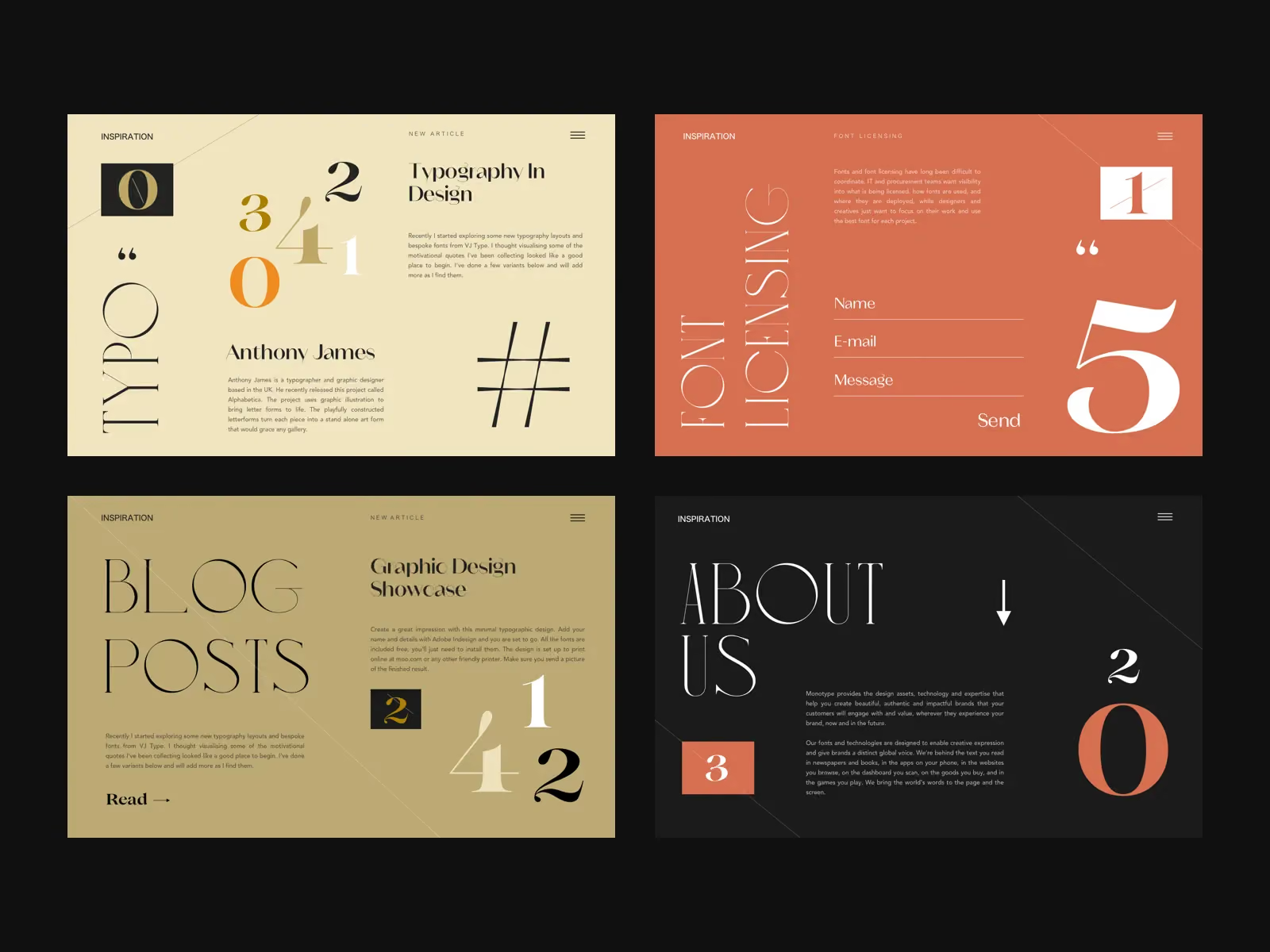
Typography is often treated as a cosmetic decision.
It is much more than that.
Type influences personality, pace, authority, accessibility, and emotional tone.
A restrained serif can make a brand feel editorial or established. A geometric sans serif can communicate precision. Large expressive typography can create confidence and energy.
The key is not choosing a fashionable font.
It is choosing a visual voice that supports the promise.
Typography also creates hierarchy.
Users rarely read a web page from beginning to end. They scan and look for signals that tell them where to focus.
Strong hierarchy makes that process easier.
The visitor should be able to distinguish the primary promise, supporting evidence, detailed explanation, and next action without working to decode the layout.
When everything is emphasised, nothing feels important.
Photography Creates Emotional Context
Photography may be one of the clearest examples of why generic AI output can reduce differentiation.
The technically correct image is not always the emotionally right image.
A company may choose a photograph because it contains the right subject while ignoring how it makes the viewer feel.
Does the image feel tense or calm? Aspirational or approachable? Precise or spontaneous? Safe or adventurous? Premium or accessible?
Photography gives people a world to enter.
This is especially important when competitors offer similar functional benefits.
Features can be copied.
A distinctive emotional territory is harder to reproduce convincingly.
The goal is not simply to add more images.
It is to choose images that communicate what paragraphs of generic marketing language cannot.
Layout Hierarchy Directs Attention and Action
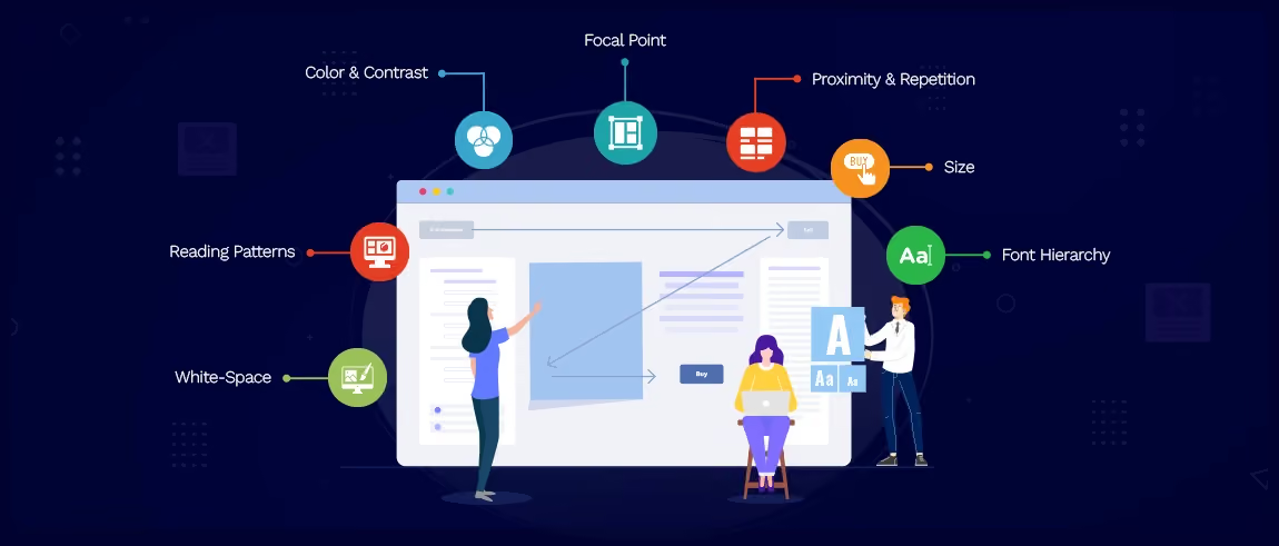
Every page is making decisions on behalf of the visitor.
What should they see first? What should they understand next? When should evidence appear? Where is hesitation likely? When is the right moment to ask for action?
Layout hierarchy turns those decisions into a visual sequence.
A common mistake is treating every website section as an independent block.
The page has a headline, a feature section, a testimonial, an FAQ, and a CTA, but there is little progression between them.
Technically, the page is complete.
Emotionally, it feels flat.
A stronger experience creates momentum.
The opening establishes relevance. The next section deepens desire. Evidence reduces doubt. Product detail builds understanding. Social proof strengthens confidence. The CTA arrives when the visitor has enough reason to move.
Good layout is therefore a form of storytelling.
It controls pace.
Why AI Alone Falls Short
AI is not the enemy of emotional design.
It can be an extraordinary collaborator.
It can accelerate research, generate variations, critique messaging, explore structures, and help teams move from an empty page to a useful starting point.
The problem begins when the starting point becomes the final product.
AI systems naturally draw from patterns.
That is part of what makes them useful.
It is also why uncritical use can produce generic experiences.
The output often looks reasonable because it reflects conventions seen repeatedly across existing websites.
However, a conversion-focused experience cannot only ask, "What normally goes here?"
It must ask more specific questions.
What does this particular audience fear?
What do they desire?
What would make this brand believable?
What emotional reaction should the first screen create?
What contradiction is preventing action?
What does confidence look like for this buyer?
These questions require context and judgement.
They often require observing real behaviour rather than generating another variation.
As I argued in the talk, we still make decisions as human beings. We respond to visual appeal, photography, typography, colour, composition, and the feeling created when a page first appears.
AI can assist in creating those elements, but teams still need to intentionally direct the emotional outcome.
Generic Experiences Quietly Reduce Conversion
The danger of generic design is not always obvious.
A generic website can still look clean.
It can still function.
It may even receive positive feedback internally.
The problem is what it fails to create.
It does not create recognition. It does not build strong preference. It does not make the customer feel that the brand uniquely understands them.
When several competitors make similar claims using similar layouts and similar AI-generated language, the customer has little emotional reason to prefer one.
Price becomes more important.
Familiarity becomes more important.
The strongest existing brand wins.
This is why emotional differentiation matters commercially.
It gives a customer something to remember and a reason to care.
Better Design Still Needs Better Measurement
There is an uncomfortable truth in design: a team can create something beautiful and still fail to improve the business.
This is where measurement matters.
Historically, many businesses have treated design feedback as subjective.
One person likes the new photography. Another prefers the old homepage. A stakeholder asks for a larger logo.
The conversation becomes dominated by taste.
A stronger optimisation approach asks what happened after the change.
Did more users reach the pricing page? Did product-page engagement improve? Did conversion increase? Did a redesigned page contribute to more successful journeys? Did mobile users behave differently? Did a performance regression offset the benefit of the new design?
These are more useful questions.
Cromojo's article on analytics blind spots explores a related problem. Aggregate metrics can simplify reality so much that meaningful differences disappear. Averages may hide visitors who convert quickly, hesitate unusually long, or abandon at a critical point.
Better design needs better observation.
How Website Monitoring Supports Better Human Experiences
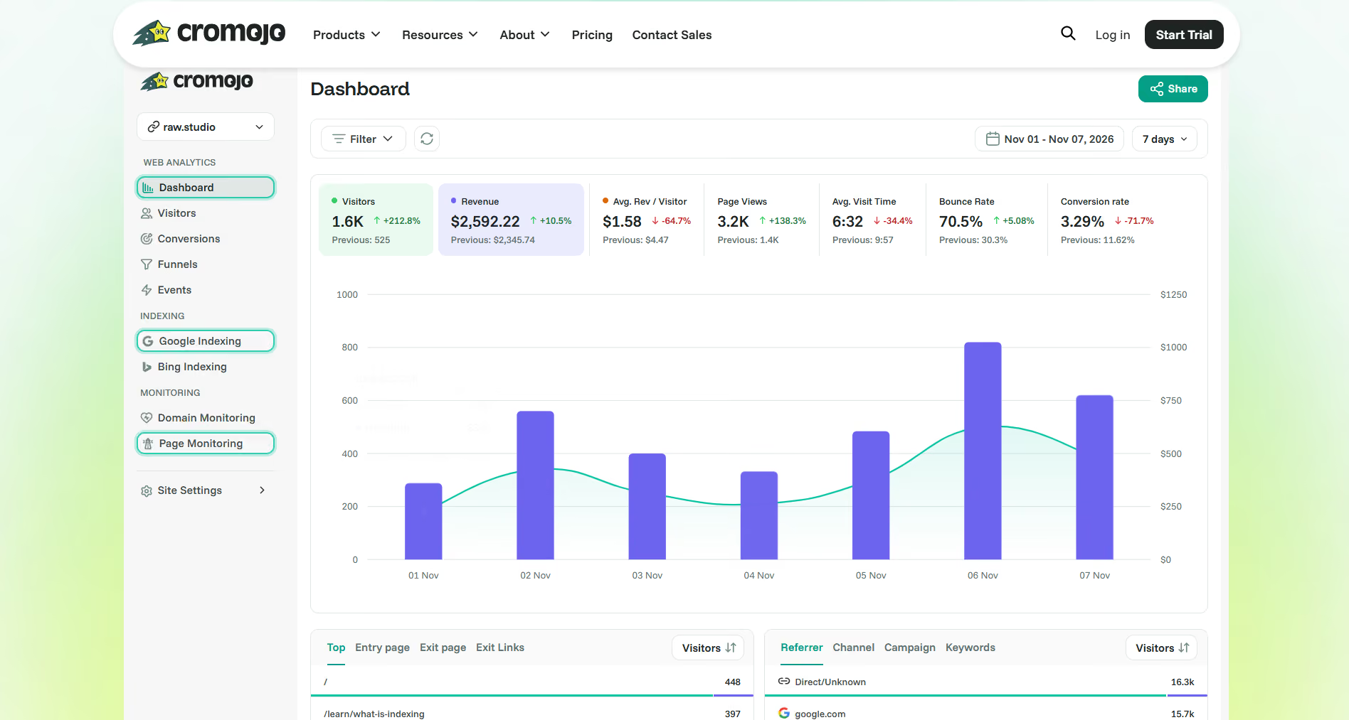
Website monitoring may sound like infrastructure rather than design.
In reality, the two are closely connected.
The experience a designer creates is only valuable if real users can actually receive it as intended.
A premium hero image loses its impact if it takes too long to appear. A carefully designed interaction fails if a script blocks responsiveness. A clear CTA cannot convert when the page is unavailable. A polished mobile layout has limited value if users on slower networks experience severe delays.
This is why website monitoring should go beyond occasionally checking whether the homepage is online.
Cromojo's guide to how website monitoring tools work explains how different monitoring approaches reveal different parts of the experience.
Real user monitoring, for example, can show how actual visitors experience a website across devices, locations, and network conditions.
That matters because the experience in a designer's browser is not necessarily the experience customers receive.
Measure Design Impact, Not Just Design Output
The traditional design process often ends at launch.
The page is approved, development is completed, the website goes live, and everyone moves to the next project.
A better process treats launch as the beginning of observation.
Teams should watch what happens after a redesign, campaign, or content update.
Did engagement change? Did important pages become slower? Did users move through the journey differently? Did the design improve conversion while creating a performance cost elsewhere?
Cromojo's guide to real user monitoring focuses on understanding actual user conditions rather than relying only on controlled tests.
This creates a more honest feedback loop.
Design creates a hypothesis.
Users respond.
Measurement reveals what changed.
The next iteration improves the experience.
Connect Engagement With Conversion Outcomes
More engagement is not automatically better.
A visitor spending longer on a pricing page may be deeply interested, but they may also be confused.
A user viewing five pages may be exploring enthusiastically, but they may also be unable to find basic information.
Metrics need context.
This is why the goal should be to connect engagement patterns with meaningful outcomes.
Which journeys tend to result in conversion? Which pages contribute to customer confidence? Where do high-intent visitors leave? What changes after a redesign? Which experiences create action rather than simply activity?
This is closely aligned with Cromojo's broader approach to conversion rate optimization: growth does not come from traffic alone. The experience needs to help existing visitors become customers.
The opportunity is to bring human-centred design and measurement together.
Optimise for Trust and Performance
The strongest digital experiences in the AI era will not choose between emotion and data.
They will use both.
Emotion creates desire. Clarity creates understanding. Credibility creates belief. Confidence reduces risk. Convenience protects momentum.
Performance ensures the experience works in reality.
Measurement tells you whether the combination is producing better outcomes.
This is the connection between emotional design and website monitoring.
You should care how the page feels.
You should also know whether it loads properly, stays available, performs across real conditions, and supports conversion.
A website should not merely look impressive in a presentation.
It should perform when real customers arrive.
Emotional Design Is the Advantage AI Cannot Easily Commoditise
AI will continue improving.
Generated websites will become more polished. Copy will become more persuasive. Prototypes will become faster.
The baseline will rise again.
That makes emotional differentiation more important, not less.
When competent execution becomes abundant, customers will have even more similar options to evaluate.
The brands that stand out will be those that combine technological efficiency with a clear understanding of human behaviour.
They will know what emotion they want to create. They will understand what customers need to believe. They will design the critical moments where confidence is gained or lost.
Most importantly, they will measure whether the experience actually performs.
AI can help create the page.
Humans still need to make it matter.
Build Experiences That Earn Trust and Drive Action
In the AI era, a functional website is only the baseline.
Your customers still judge the experience through human eyes. They respond to storytelling, typography, photography, hierarchy, clarity, credibility, confidence, and convenience.
Cromojo helps you add the performance and measurement layer behind those experiences.
With website monitoring and real-time visibility into how your site performs, you can identify issues that undermine trust, understand performance changes, and protect critical customer journeys before small problems become expensive ones.
Create the emotional connection.
Measure the real experience.
Optimise what happens next.
Always online. Always fast. Always ahead.
Start monitoring your website with Cromojo