

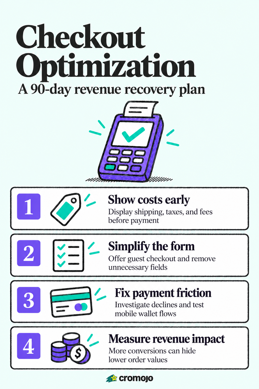
If you fix one thing this week, fix the checkout page. Showing total cost upfront, enabling guest and express checkout, cutting visible form fields, and resolving payment declines are the changes that move revenue fastest. Baymard estimates checkout design improvements can lift conversion by roughly 35% on average for large ecommerce sites, and trimming form fields alone can add another 2 to 5%.
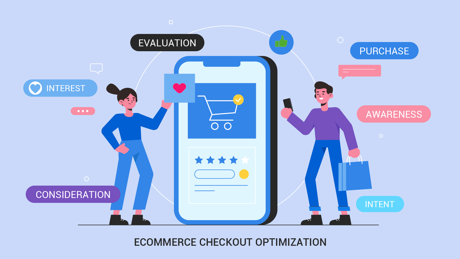
Quick-win checklist you can run this afternoon
Before you touch analytics or run a test, there are changes you can make in under an hour that typically pay for themselves within days.
- Display the full order total, including shipping, taxes, and fees, on the cart page, not just at the final step.
- Make guest checkout the default path and push account creation to after purchase.
- Add express-pay buttons (Apple Pay, Google Pay, PayPal) above the fold on the first checkout screen.
- Turn on address autocomplete so shoppers stop typing full addresses by hand.
- Show a visible order summary and estimated delivery date next to the payment form.
- Confirm your checkout page runs on TLS and displays recognizable payment and security badges.
- Run a quick performance check: look at cumulative layout shift and page load time on mobile.
Pro Tip: After each fix, check your payment success rate and checkout-step event counts in analytics within 48 hours. If they do not move, the fix did not address your real leak.
Once you have made these changes, confirm they worked before moving to deeper analysis. A spike in checkout starts with no matching spike in completions usually means a new fix introduced friction somewhere else.
Finding your biggest leak: how to audit the checkout funnel
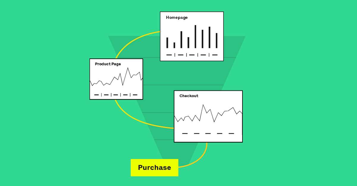
Quick wins buy you time, but a real audit tells you where revenue is actually leaking. Start by defining a closed funnel: begin checkout, add shipping, add payment, purchase. A closed funnel only counts people who entered the first step, which keeps casual browsers from diluting your numbers. Google Analytics offers a built-in Checkout journey report and a Funnel exploration template that does exactly this, and it lets you segment by device, traffic source, or cart value.
The step-by-step view matters more than your overall abandonment rate. Someone who glances at a product page and leaves was never going to buy; someone who enters their shipping address and quits mid-payment just showed you a fixable problem. Segmenting out low-intent sessions and focusing only on checkout-initiated abandonment gives you a much higher return on the time you spend fixing things, a point Baymard's cart abandonment research makes repeatedly.
- Track per-step conversion and drop-off at each of the four funnel stages, not just the first and last.
- Log technical signals alongside behavioral ones: JavaScript errors, payment decline codes, and validation error counts.
- Compare funnel performance by device type, since mobile and desktop often leak at different steps.
Pro Tip: Pull decline codes into a separate view. A rising decline rate on one card type often points to a gateway issue, not a design problem.
Prioritizing fixes without guessing: impact times effort
Once you know where the leak is, resist the urge to fix everything at once. Score each candidate fix on impact and effort, usually on a simple scale of 1 to 5, and prioritize anything with high impact and low effort first.
- Showing full cost early: high impact, low effort, because it is largely a display change.
- Address autocomplete: high impact, moderate effort, since it needs testing across address formats.
- Guest checkout as default: high impact, low effort, mostly a configuration or flow change.
- Payment orchestration or multi-gateway failover: high impact, high effort, best scheduled later.
Run one hypothesis per experiment, on a weekly cadence if your traffic allows it. Testing two changes at once might feel efficient, but you lose the ability to say which one actually worked.
- Pick the single highest-scoring fix from your impact-versus-effort list.
- Define the metric you expect to move, ideally revenue per session rather than conversion rate alone.
- Estimate your minimum detectable effect before launching, so you know how long the test needs to run to be trustworthy.
- Set a rollback trigger in advance: if revenue per session drops meaningfully during the test, stop it rather than waiting for statistical significance.
Measuring revenue impact instead of conversion rate alone matters because a change can lift conversions while lowering average order value, which quietly cancels out the win.
Trimming the checkout form without losing information you need
Form length is one of the clearest levers in checkout design. The average US ecommerce checkout contains about 23.48 form elements, while an ideal flow can run on roughly 12, according to Baymard's benchmark research. That gap is often filled with fields that could be optional, hidden, or merged.
- Collapse first and last name into a single field where your shipping carrier allows it.
- Hide optional fields like a second address line or company name behind a toggle.
- Combine shipping and billing address by default, with an edit option for mismatches.
- Replace separate city, state, and ZIP fields with address autocomplete wherever possible.
Address autocomplete is a highly effective fix. Done well, it can significantly reduce address entry time, while potentially increasing conversion by a small but meaningful margin when paired with express payment options, based on Baymard's data. Done poorly, it becomes a new source of friction: autocomplete implementations that fail on apartment numbers or international formats create loops that increase form errors rather than reducing them. Test your autocomplete against the actual address formats your customers use before shipping it.
Inline validation should catch errors as the shopper types, not after they hit submit, and it should never wipe out what they already entered. Button labels matter more than they seem: "Place Order, $84.20" tells shoppers exactly what happens next, while a plain "Submit" leaves them guessing.
Pro Tip: Test your form with a screen reader and with one hand on a phone. Both expose friction that a desktop walkthrough will miss.
Payment options and mobile checkout: where drop-off hides
Payment friction and mobile friction tend to show up together, since most checkout sessions now start on a phone. Keep card payment as the clear primary path, but put wallet buttons like Apple Pay and Google Pay above the fold so shoppers who have them saved can skip typing entirely. If a payment method redirects to another page, label it clearly so shoppers are not confused when the screen changes.
- Minimize typing wherever possible: use the device camera for card capture and geolocation for shipping address, guidance echoed in NN/g's mobile checkout research.
- Keep the order summary and delivery estimate visible on mobile, not tucked behind a collapsed panel.
- Use the correct input type for each field, such as a numeric keypad for card numbers and phone numbers.
- Review payment and mobile setup periodically. The RickStart Marketing overview of ecommerce setup covers common mobile-checkout gaps worth checking against your own flow.
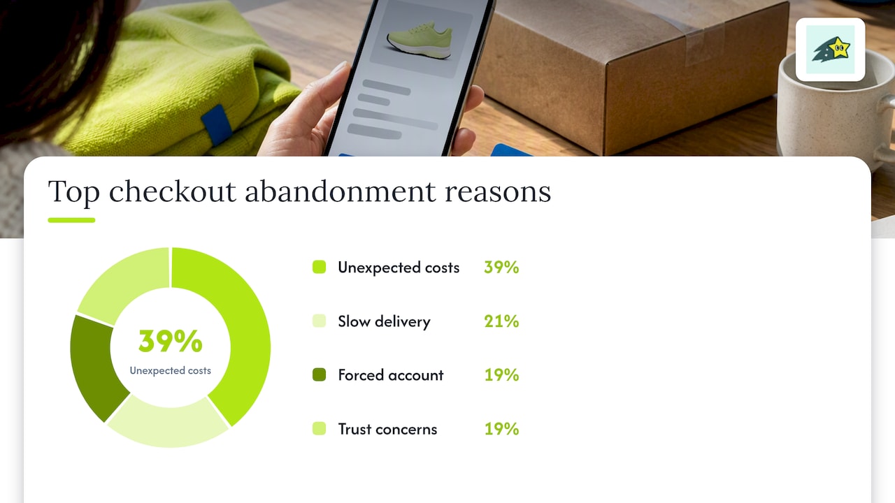
Statistic callout: Unexpected costs are the single biggest reason shoppers abandon checkout, cited by 39% of respondents in Statista's 2025 cart abandonment survey, ahead of slow delivery (21%), forced account creation (19%), and trust concerns (19%).
When a payment declines, avoid a generic "card declined" message. Collect the actual decline code and route shoppers toward a specific next step: retry, try another card, or request a manual payment link. Payment infrastructure providers such as Cray focus specifically on improving completion rates through better decline handling, which is worth understanding even if you build your own flow in-house.
Catching hidden technical friction before it costs you revenue
Some of the worst checkout leaks never show up in a design review because they are technical, not visual. Session loss during a payment redirect, a gateway timeout that silently fails, or a validation script that blocks submission on certain browsers can all drain revenue while your checkout looks fine on screen.
- Watch for a gap between checkout starts and payment attempts. That gap often means a redirect or script failure, not shopper hesitation.
- Log the distribution of payment decline codes by gateway and card type, not just a single aggregate decline rate.
- Monitor JavaScript errors and form validation failure counts on the checkout page specifically, separate from the rest of the site.
- Track revenue by funnel step, not just conversion count, so a drop in average order value does not hide behind a flat conversion rate.
Real-time, revenue-first analytics make these patterns visible faster than a weekly report ever could. Cromojo's revenue analytics tooling ties checkout events directly to Stripe and Shopify transactions, which shortens the time between a regression appearing and a team noticing it. For a closer look at how monitoring signals reveal these drops, see what monitoring data can tell you about conversion drop-off.
Pro Tip: Set an alert on checkout-to-payment conversion specifically. A sitewide traffic dip can mask a localized checkout failure for days.
A 30/60/90 day roadmap for checkout improvements
Spreading these fixes over a quarter keeps the work manageable and gives each change room to show its real effect before the next one lands.
- Days 1 to 30: ship guest checkout, display full cost early, and add express-pay buttons. Measure checkout-start to purchase conversion weekly.
- Days 31 to 60: prune form fields toward the 12-element target, add address autocomplete, and fix inline validation. Measure form completion time and address-step drop-off.
- Days 61 to 90: introduce personalization such as relevant upsells, review payment orchestration for decline recovery, and formalize the weekly single-hypothesis testing cadence.
Before each sprint ships, confirm stakeholder sign-off on the rollback criteria and run the change on a staging checkout with real test cards. A guide to diagnosing leaks in more depth, including how to calculate recovered revenue from reduced abandonment, is covered in Cromojo's conversion funnel guide.
Why checkout work never really finishes
Most teams treat checkout optimization as a project with an end date. It is not. It is closer to maintenance: a payment gateway update, a new shipping carrier, or a mobile OS change can quietly reintroduce friction you already fixed once.
The habit worth building is simple: watch abandonment after checkout start, not your overall site abandonment rate. The second number mixes in every visitor who was never going to buy, and it hides the handful of specific leaks that are actually costing you revenue. Revenue per session, tracked at each funnel step, tells you faster than conversion rate alone whether a change helped or just moved the problem somewhere else. If you want to see how this kind of tracking plays out operationally, Cromojo's writing on conversion rate optimization walks through it in more detail.
Philippe
How Cromojo supports ongoing checkout optimization
Running the roadmap above gets easier when you can see which checkout changes actually affect revenue, not just clicks. Cromojo connects directly to Stripe and Shopify to attribute real-time revenue by page, channel, and funnel step, so a form-field fix or a new express-pay button shows up as a dollar figure, not just a conversion percentage.
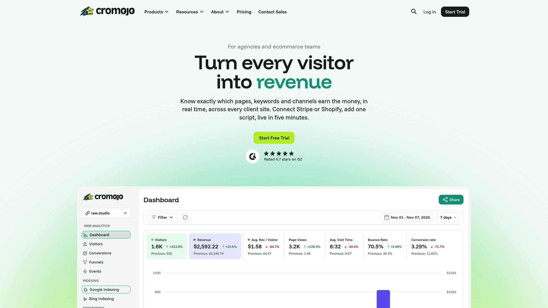
- Revenue-first funnel tracking that ties checkout events to actual Stripe and Shopify transactions.
- Automated site monitoring and SEO health checks that catch broken checkout pages or redirect failures early.
- Cookieless, privacy-friendly tracking that sets up with a lightweight script across most tech stacks.
- A Conversion Optimization Service, from $3,800 per month, for teams that want hands-on checkout audits.
If you want to see where your own checkout funnel is leaking revenue, check the Cromojo pricing page for plans starting at $19 per month, or request a CRO audit to get a second set of eyes on your roadmap.
Where this research comes from
This article draws on Baymard's checkout usability benchmark, NN/g's mobile checkout guidance, Statista's cart abandonment survey, and Google Analytics' funnel documentation. For mobile-specific design patterns beyond checkout, Coumba Win's mobile UX guidance is a useful companion read.